Overview and Problem
This was a four week solo project. I focused on creating a viable solution for mountain goers struggling to get knowledge and conditions when at new resorts. I interviewed three people who had experience with skiing, making sure to identify their pain points and goals.
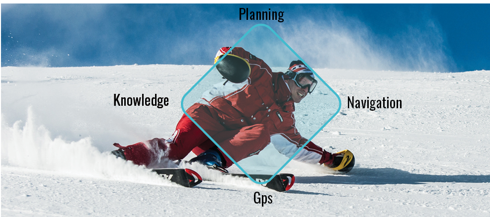
How might we create an app for mountain goers so that they can find resorts faster, manage new terrain, and spend more quality group time together?
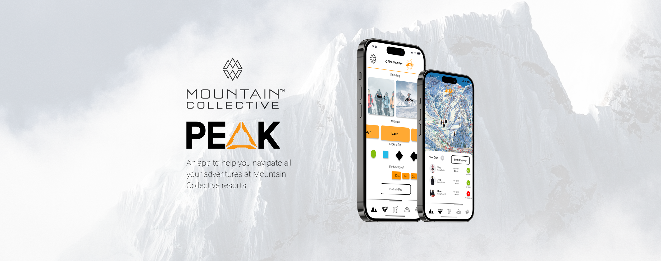
Hi-Fidelity
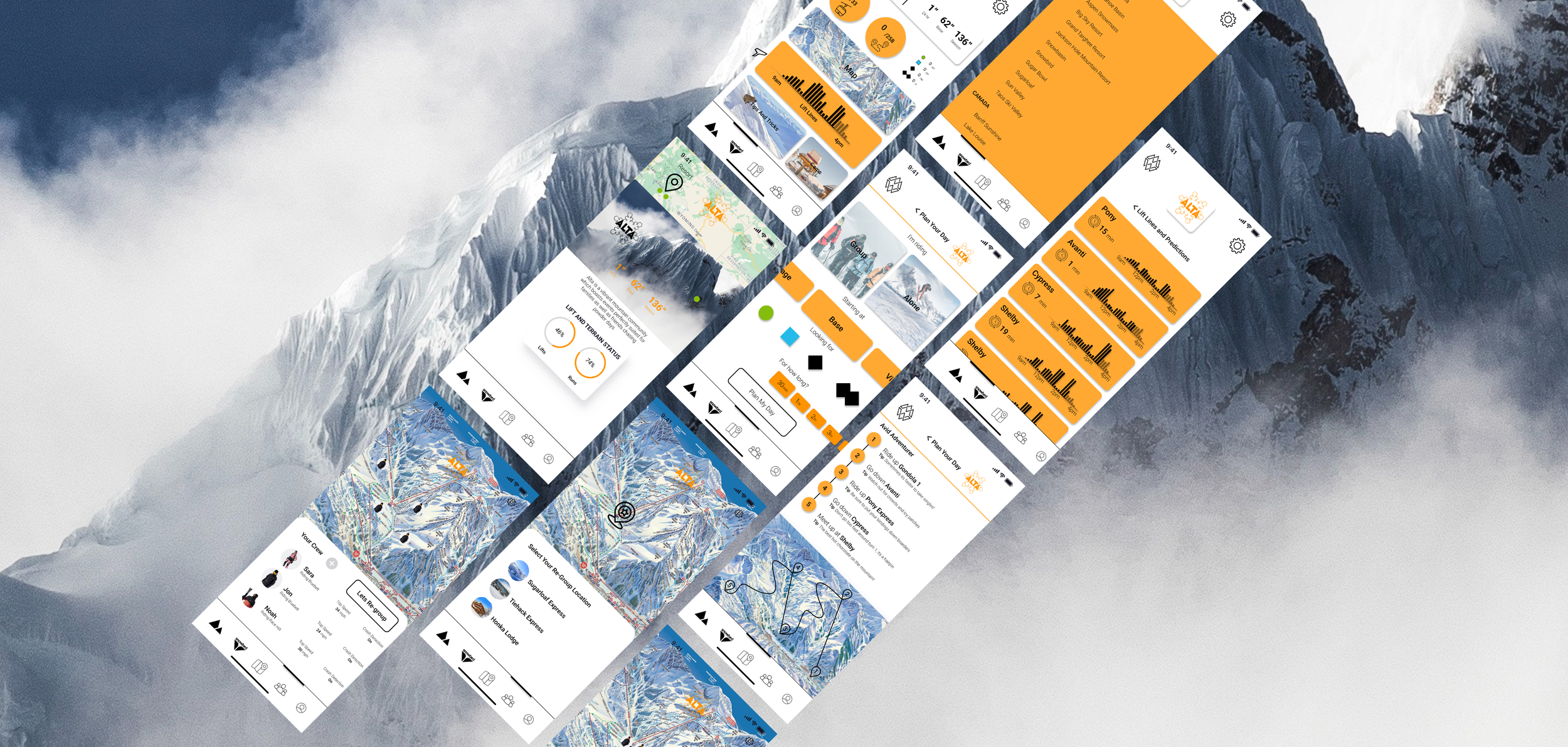
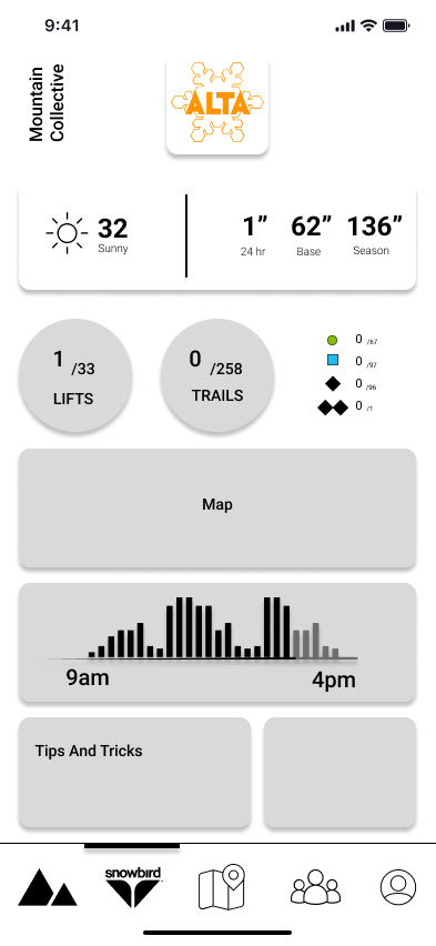
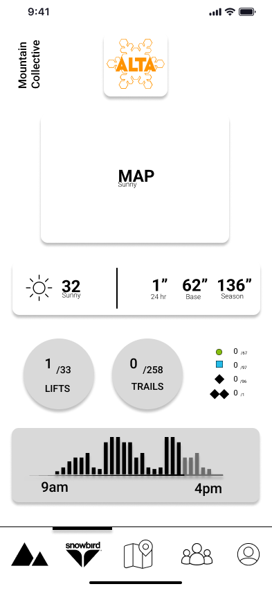
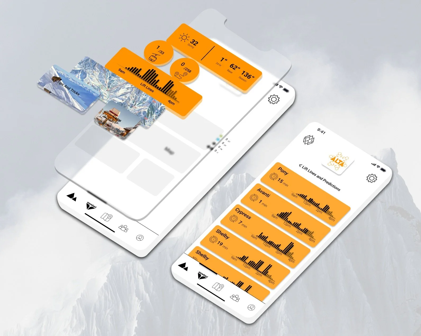
The resort tab focuses on knowledge of the current resort, lift times, predictions, interactive maps, tips and tricks, mountain cams, and open lifts, trails. weather conditions to help users gain knowledge.
Knowledge

Stay up to date on lift lines and see new predictions


Get the best information to help your experience on the mountain
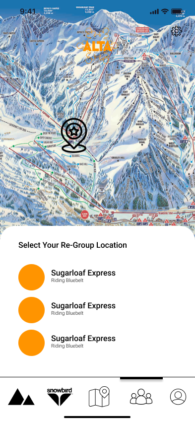
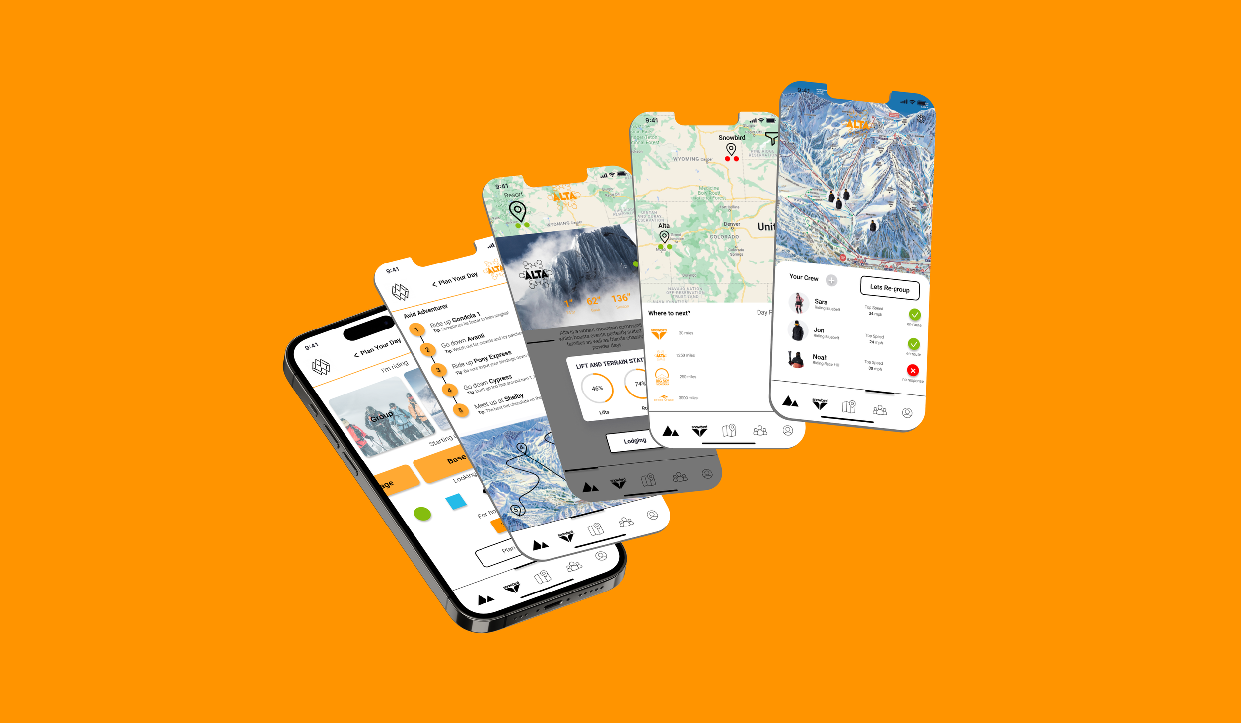
The crew tab is focused on tracking your group to ensure that nobody is left behind. Re-grouping, speed tracking and crash detection maximize this tabs features.
Tracking

Users can accept new locations or deny them to inform leader


Choose new meetup locations
Exploration
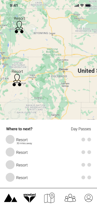
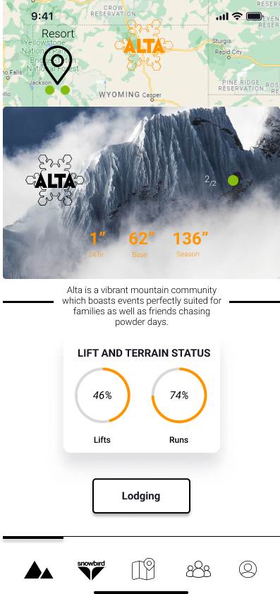
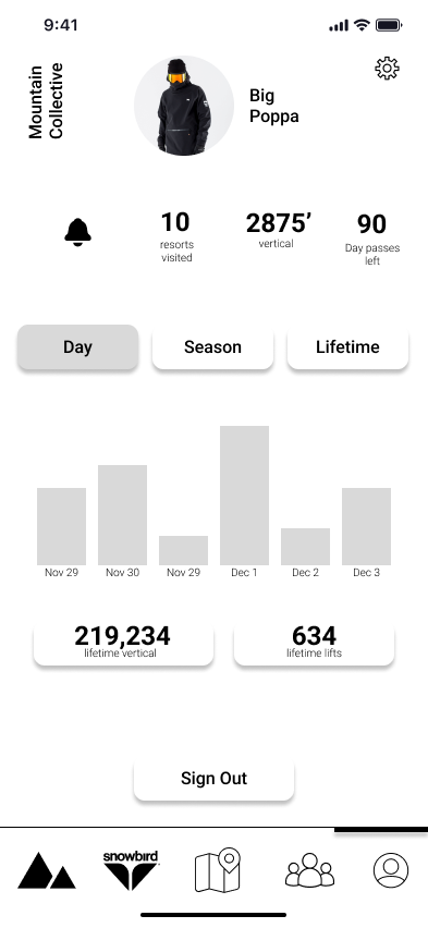
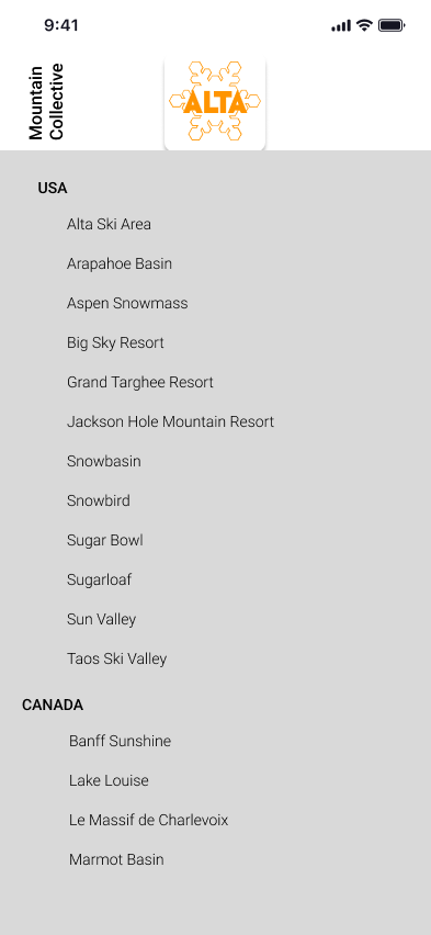
The mountains tab allows users to explore all of Mountain Collectives resorts, book lodging, and check out current snow conditions and lift/terrain status.
Easy to access lodging


Check out how many day passes users have remaining
The planning tab ensure users have a plan before they go out onto the mountain, whether in a group, or alone, routes with local tips and tricks are infused into the specialized plans.
Planning
Tailored map with details and to-do list


Customize your plan
User Research

Comparing potential user types in order to identify personalities, and business models within the industry to understand potential app development. Ultimately focusing on the alpha, as the app would cover all other three categories if the alpha was satisfied
User Types


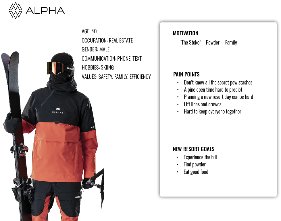

I conducted four interviews, and asked them a total of fifteen questions, from how they approached planning a day at a new resort to their personal goals at the hill. After observing their pain points and needs I gathered and created three main personas I would focus on.
In addition, I conducted surveys and gathered pain points of many other online users, some on reddit, others through google surveys, below is a summary of findings, and personas.
Product Benchmarking
Using ten of the most popular products within the marketplace to analyze the similarities and differences between categories.

A map was then created from the data of the benchmarking to discover the most optimal market categories the app could fit within
Bi-Axial Map

Analyzing users emotions and pain points to discover their needs and goals for the app. Interviews and surveys were used to collect and make data driven goals and jobs to be done.
Journey Map
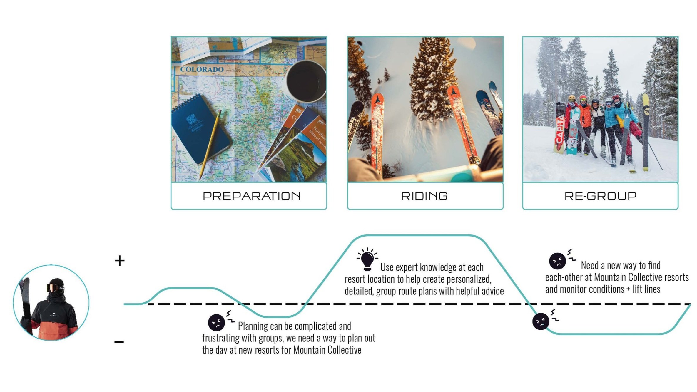
Insights and Criteria
Analyzing users emotions and pain points to discover their needs and goals for the app. Interviews and surveys were used to collect and make data driven goals and jobs to be done. From these goals, three how might we statements were created and narrowed down to one.
HMW create an app that provides knowledge and navigation for users entering a new resort?
HMW provide tailored group day plans for resort navigation?
How might we create an app for mountain goers so that they can find resorts faster, manage new terrain, and spend more quality group time together?
Moodboard and Design Language
An inspiration meant to further the progression of my own style, Orange is a primary color throughout the experience because it’s an energizing color that’s perfect for the active skiers and snowboarders who use this app.”


User Needs
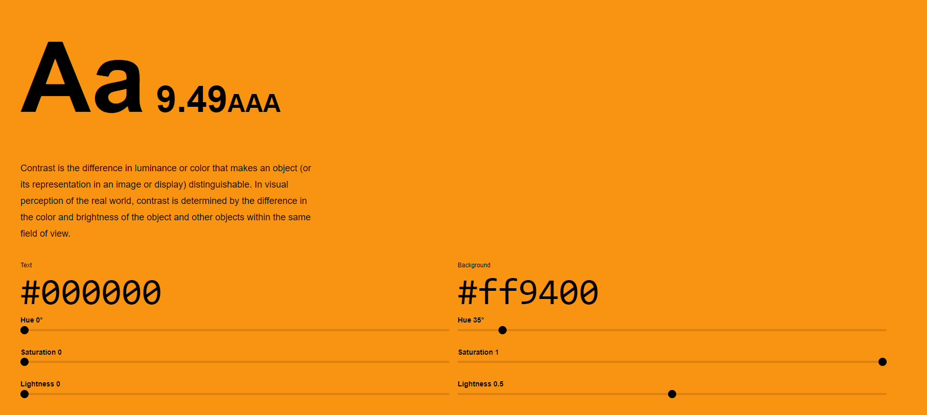
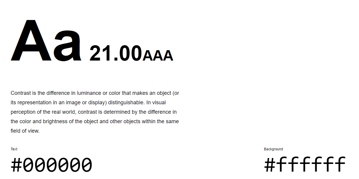
These are the two main colors and text I use in the wireframes, both meeting the AAA standard. It was important to make sure these colors were accessible for the users interacting on the app during their activities to ensure maximum efficiency in observation. My button sizes needed to be 2.5.5 target size, and for images containing text, sure the alt description includes the image's text.
Accessibility
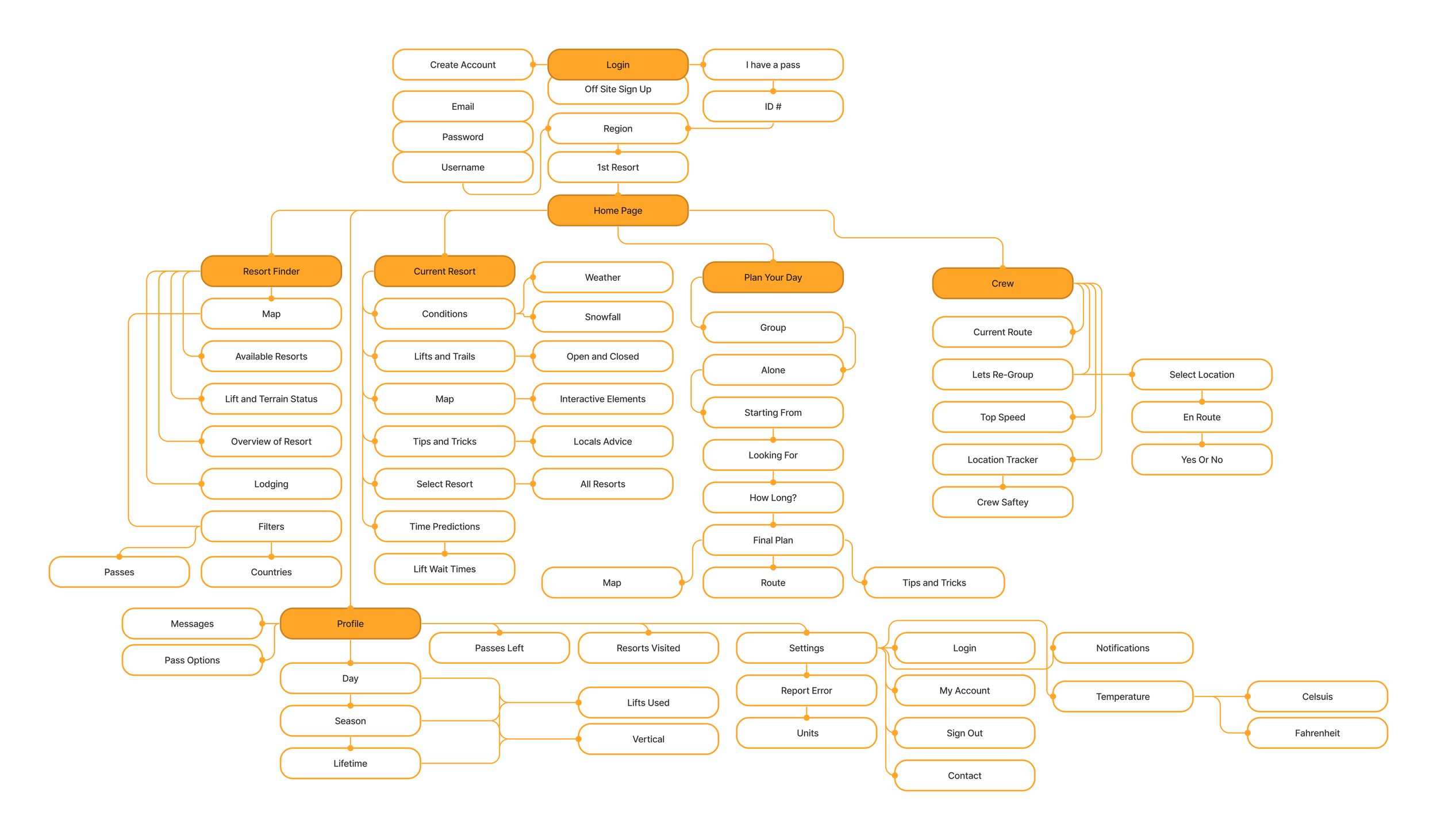
Using the site map helped me organize the overall layout of the app and helped me identify what screens I needed to create. I needed to ensure that each screen was efficiently laid out to the next for the best user experience. I created the information architecture from user feedback by starting at each individual tab on the nav bar, recognizing how that screen was indented to be used, and creating a series of actions the user could take.
Site Map
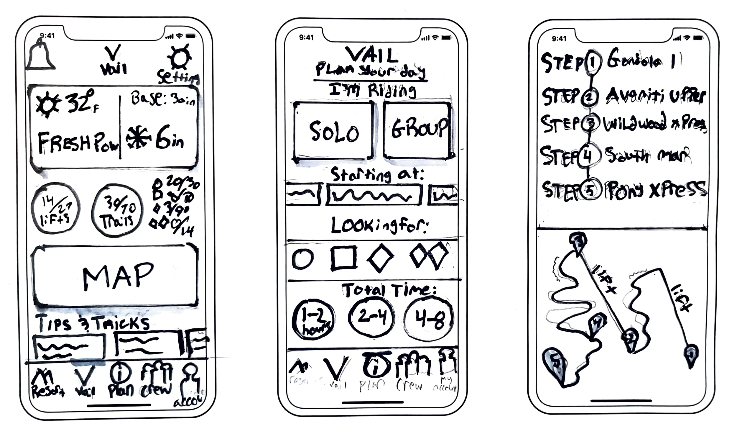
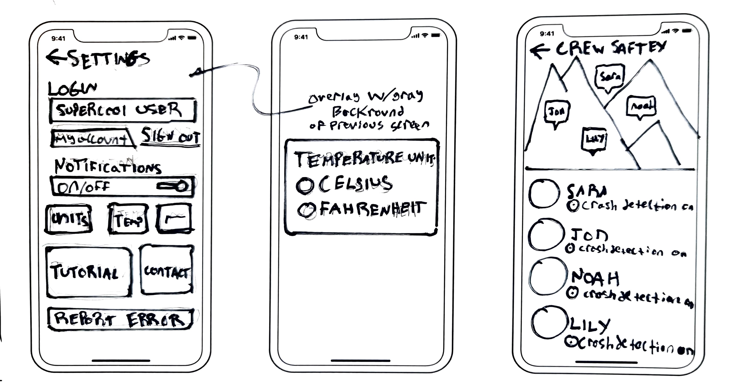
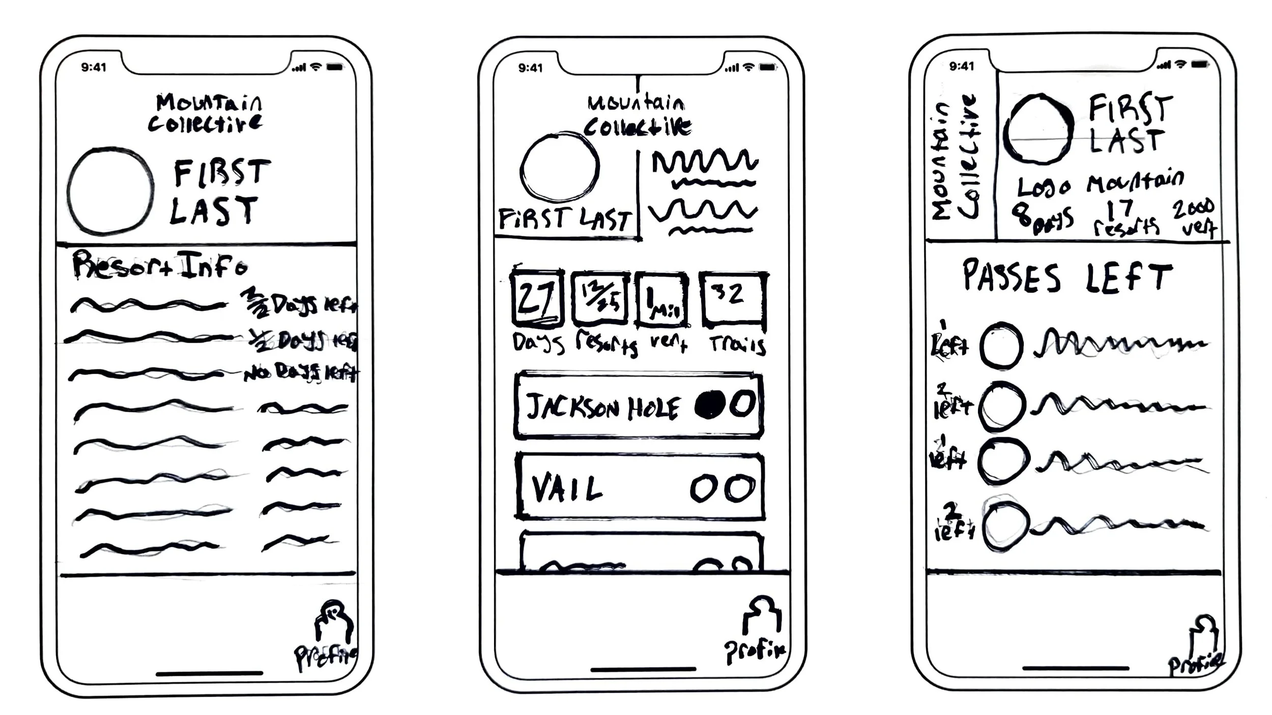
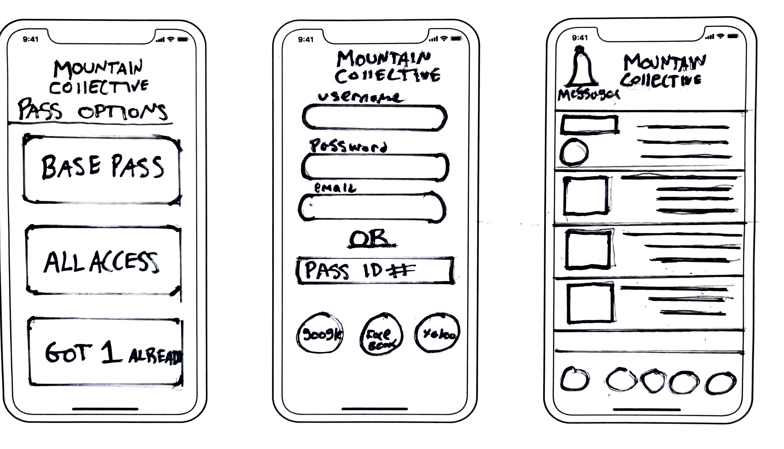
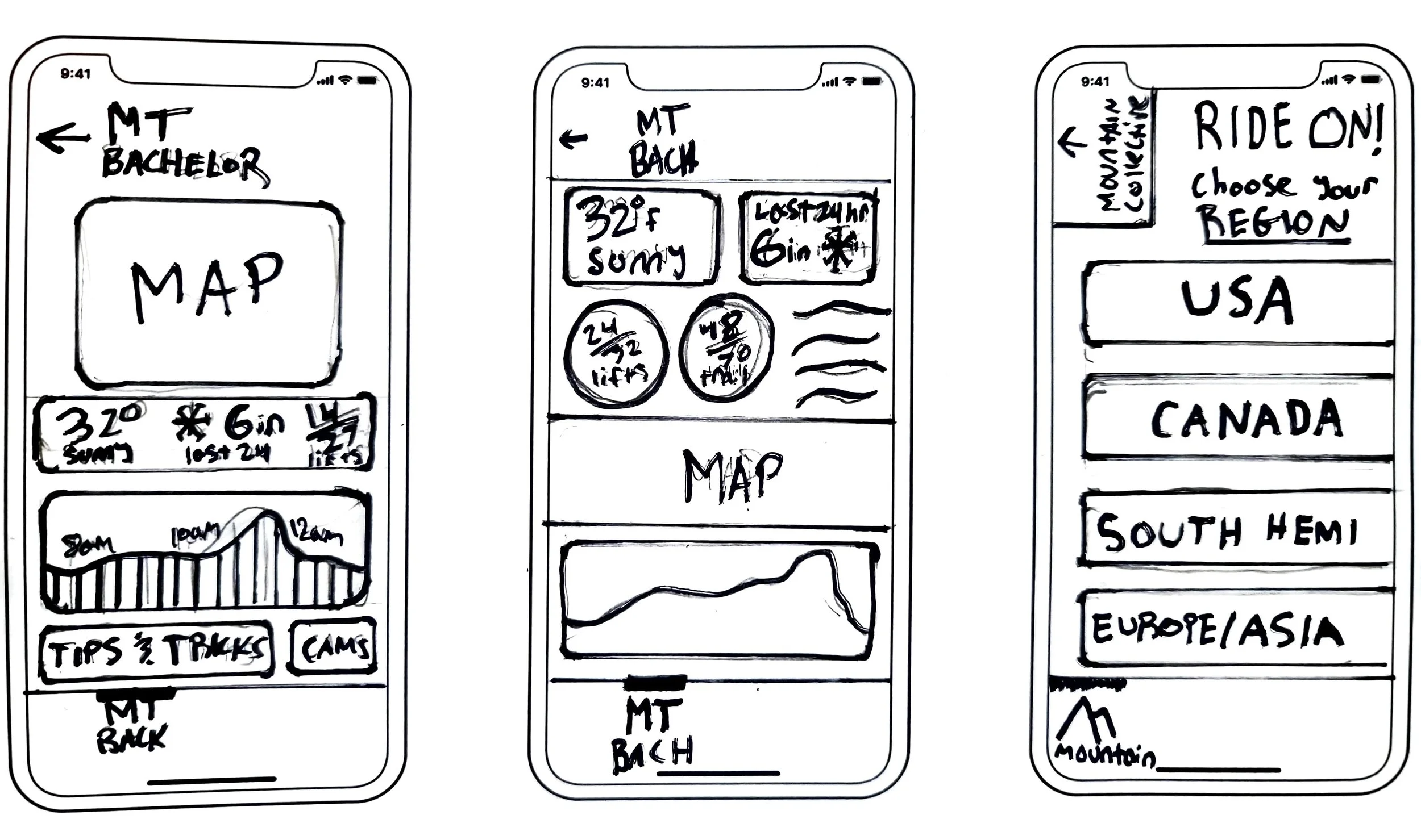
Using inspiration from my moodboard, I began to wireframe, I wanted to focus on my users problems, knowledge, and planning your day at resorts. I went through multiple variations of each page, trying to get a feel for the best solution for the user.
Lo-Fi Sketches


Lo-Fi Digital
After sketching wire-frames, I began to digitize them, adding the best components to each page, and leaving those I didn’t like out. Overall the process was focused on creating the best interface keeping in mind my users criteria and wants.


Track
Adventure
Explore
Plan
Interested in the whole process? Download it here
Takeaways: I didn’t have time to conduct user testing, and as that’s a huge part of UX design I would love to incorporate that into my next works. Going forward I will remember to have usability testing at the forefront of my work.
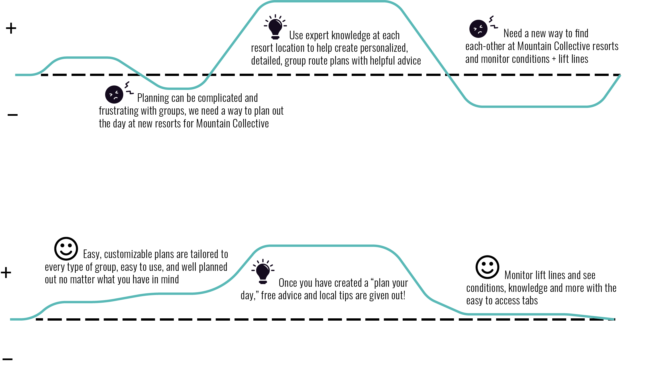
A comparison of user frustrations before and after creating the hi-fi solutions.
Solutions
Before
After
